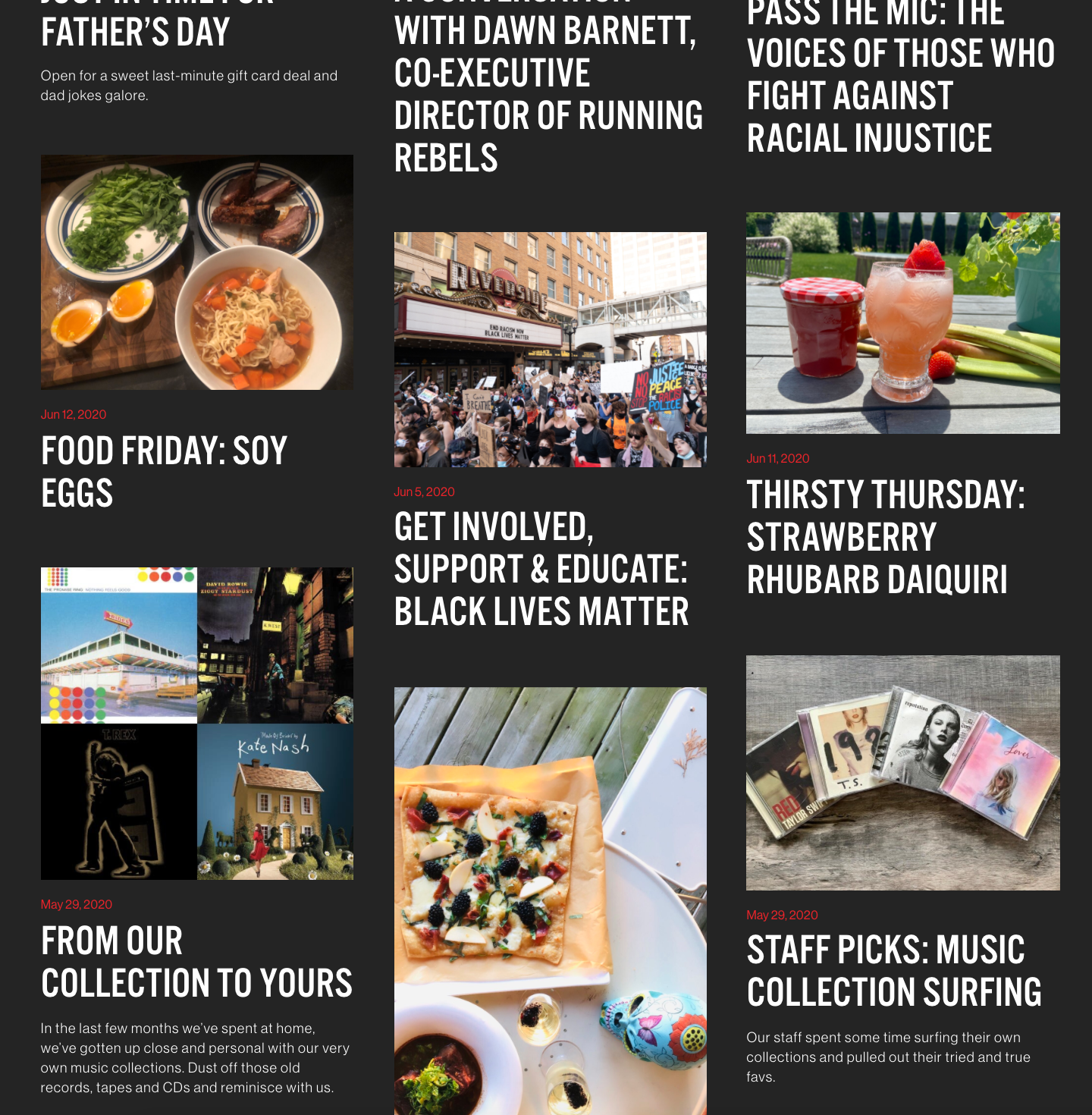
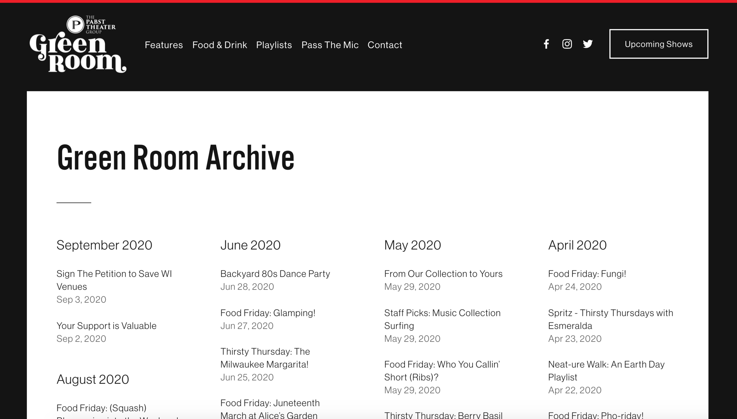
Green Room - Digital Music Magazine

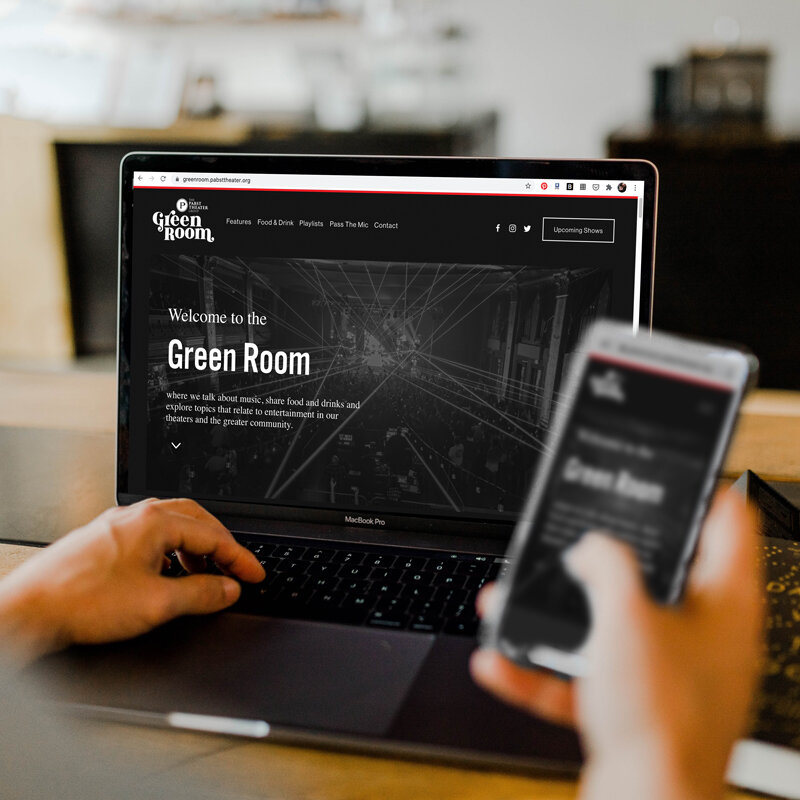
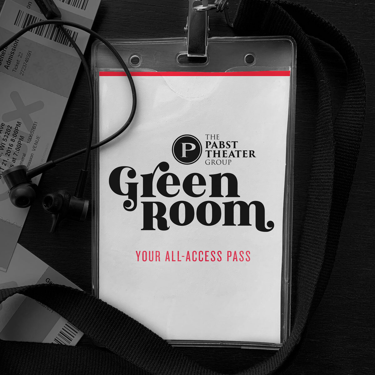
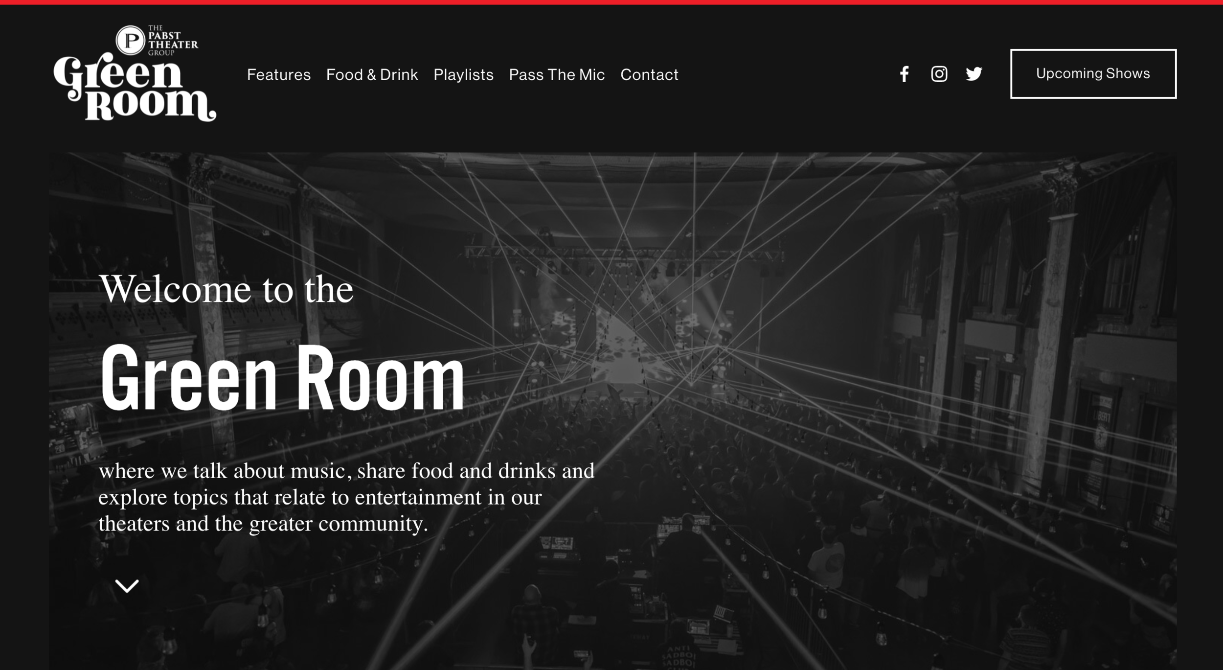
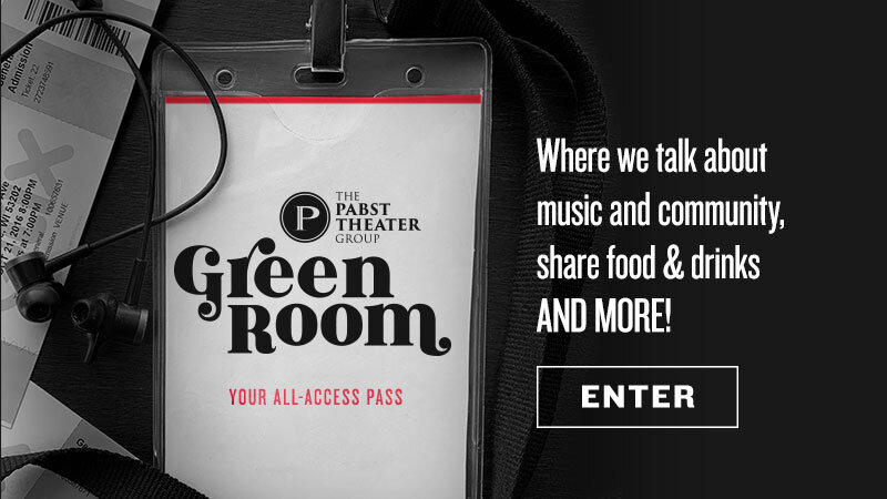
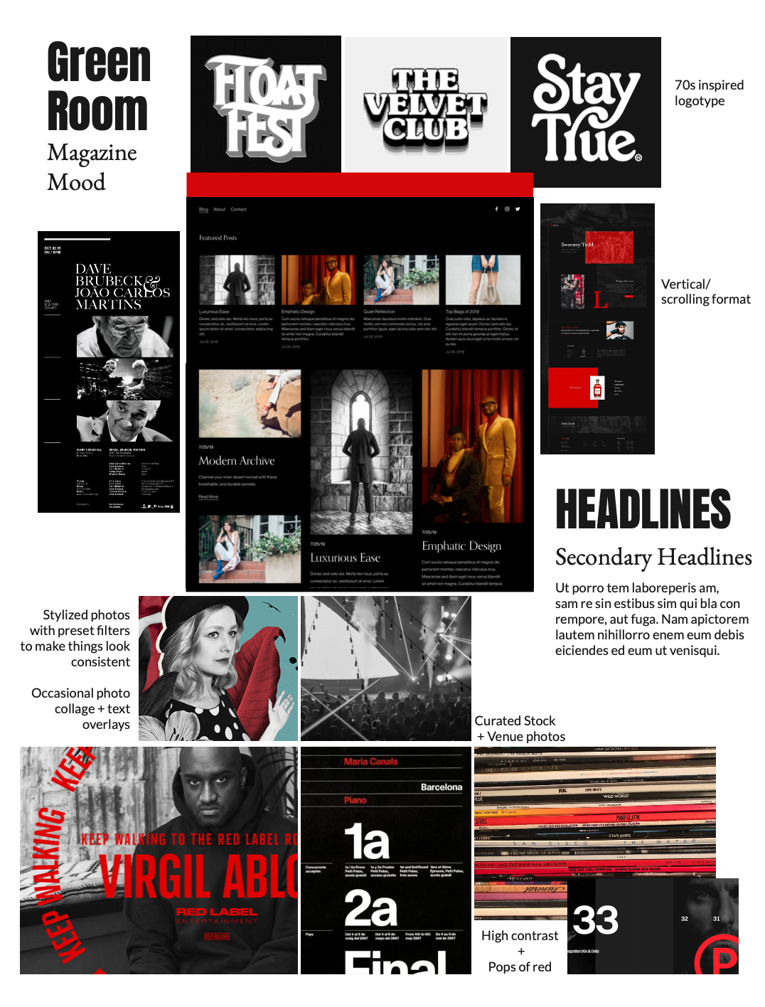
The Green Room is a web-based magazine run by the Pabst Theater Group. Inspired by theater green rooms where performing artists relax before a show, the magazine is a forum for exploring topics that relate to entertainment in the Pabst Theater Group’s venues and the greater community. Drawing inspiration from the visual library of independent music, the site is a nod to DIY punk posters, 70s logotypes, and the modern concert experience. A coordinating launch campaign plays on the concept of a backstage pass, inviting viewers to step inside the Green Room.

Turner Hall Ballroom photos by Will Hues

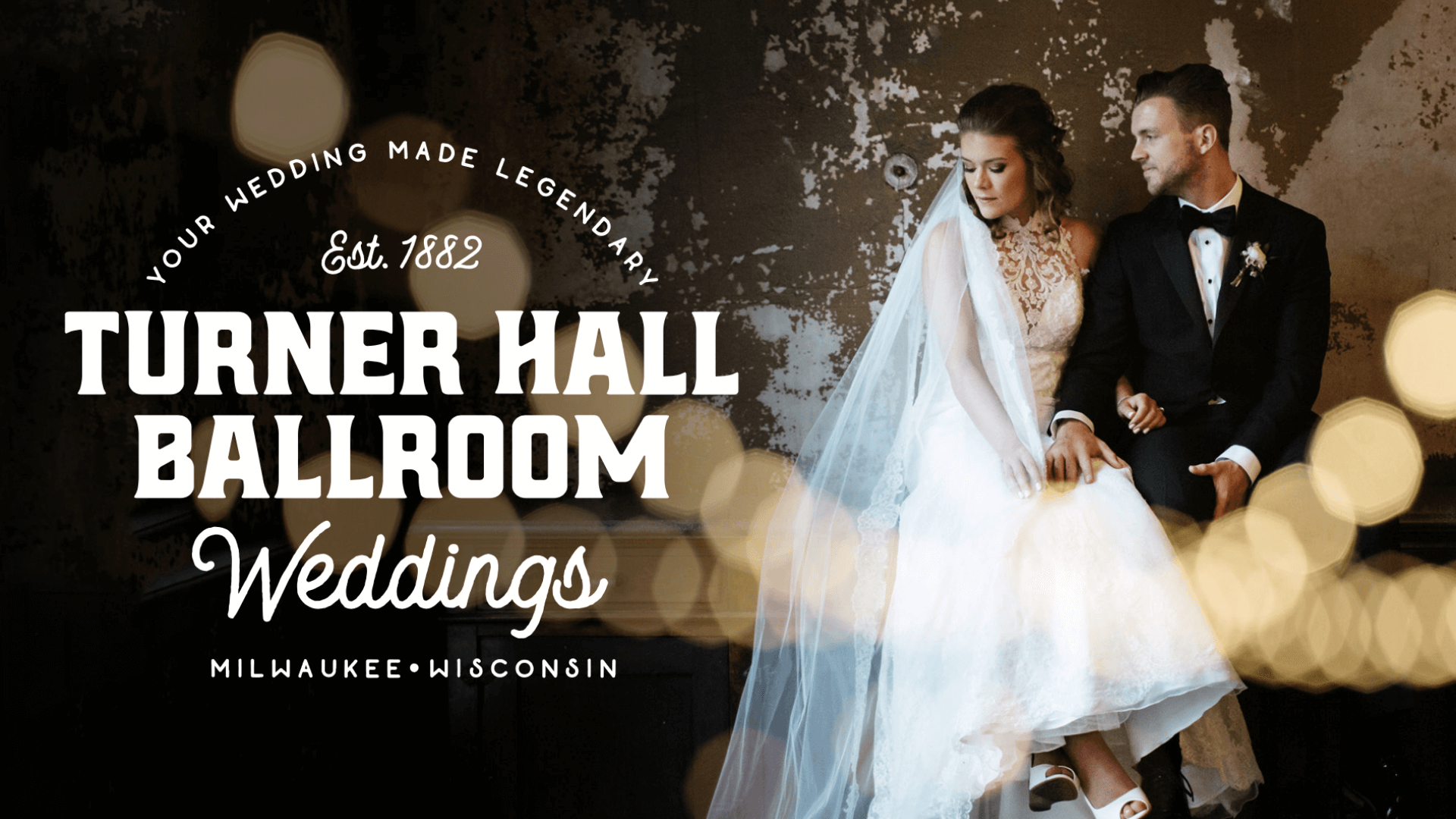
Wedding Venue Site Redesign

Turner Hall Ballroom Weddings needed to set itself apart in an increasingly competitive local market as the trend of weddings in non-traditional spaces means new venues are opening all the time.

To give Turner Hall an edge, I lead a redesign of the previously brochure-style venue website, creating a site that was more immersive and modern, including a contemporary-feeling logo that nods to the venue's history.

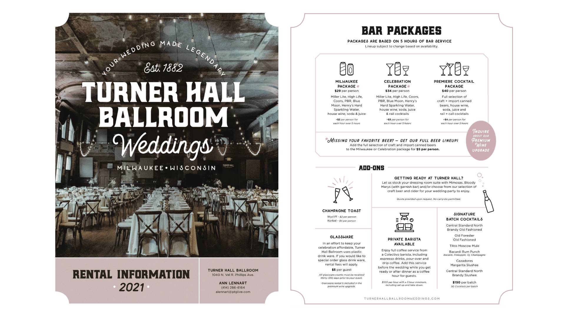
Many couples have no experience with wedding planning before they get engaged, and I knew this was an opportunity to make Turner stand out. Working with the private events director, I added an entire toolkit of features to help couples make their decision including vendor recommendations, room Layout examples, links to galleries of other weddings at the venue and other local resources.

Click to expand

Click to expand

Boutique Film Production Company Website

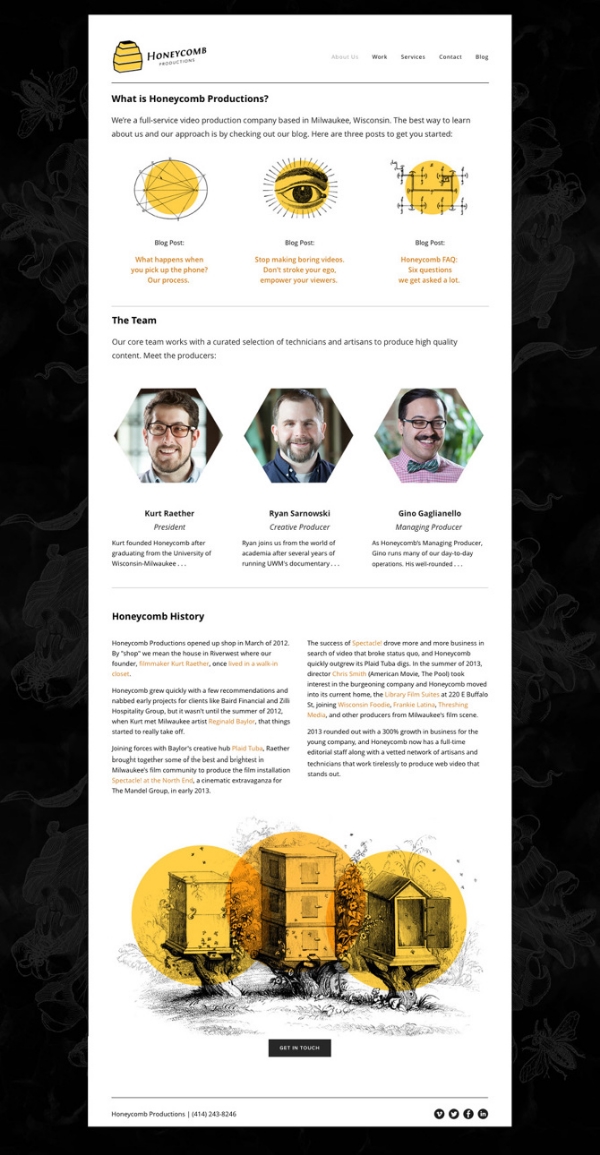
After creating graphics and providing project support for a number of videos for Honeycomb Productions, they asked me to help design their new logo and website. Under the direction of president Kurt Raether, I gave the Honeycomb website a playful approach, using vintage illustrations paired with a dramatic black, white, and goldenrod color scheme to promote their services as a boutique and classically cinematic production company.

Animator Matthew Dwyer followed the playful illustration style in his quirky introduction to the Honeycomb Reel embedded on the homepage. In addition to creating the site's graphic style, I also consulted on the site's navigation structure and assisted with copywriting.