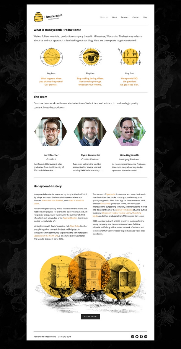
After creating graphics and providing project support for a number of videos for Honeycomb Productions, they asked me to help design their new logo and website. Under the direction of president Kurt Raether, I gave the Honeycomb website a playful approach, using vintage illustrations paired with a dramatic black, white, and goldenrod color scheme to promote their services as a boutique and classically cinematic production company.
Animator Matthew Dwyer followed the playful illustration style in his quirky introduction to the Honeycomb Reel embedded on the homepage. In addition to creating the site's graphic style, I also consulted on the site's navigation structure and assisted with copywriting.


